DESIGN
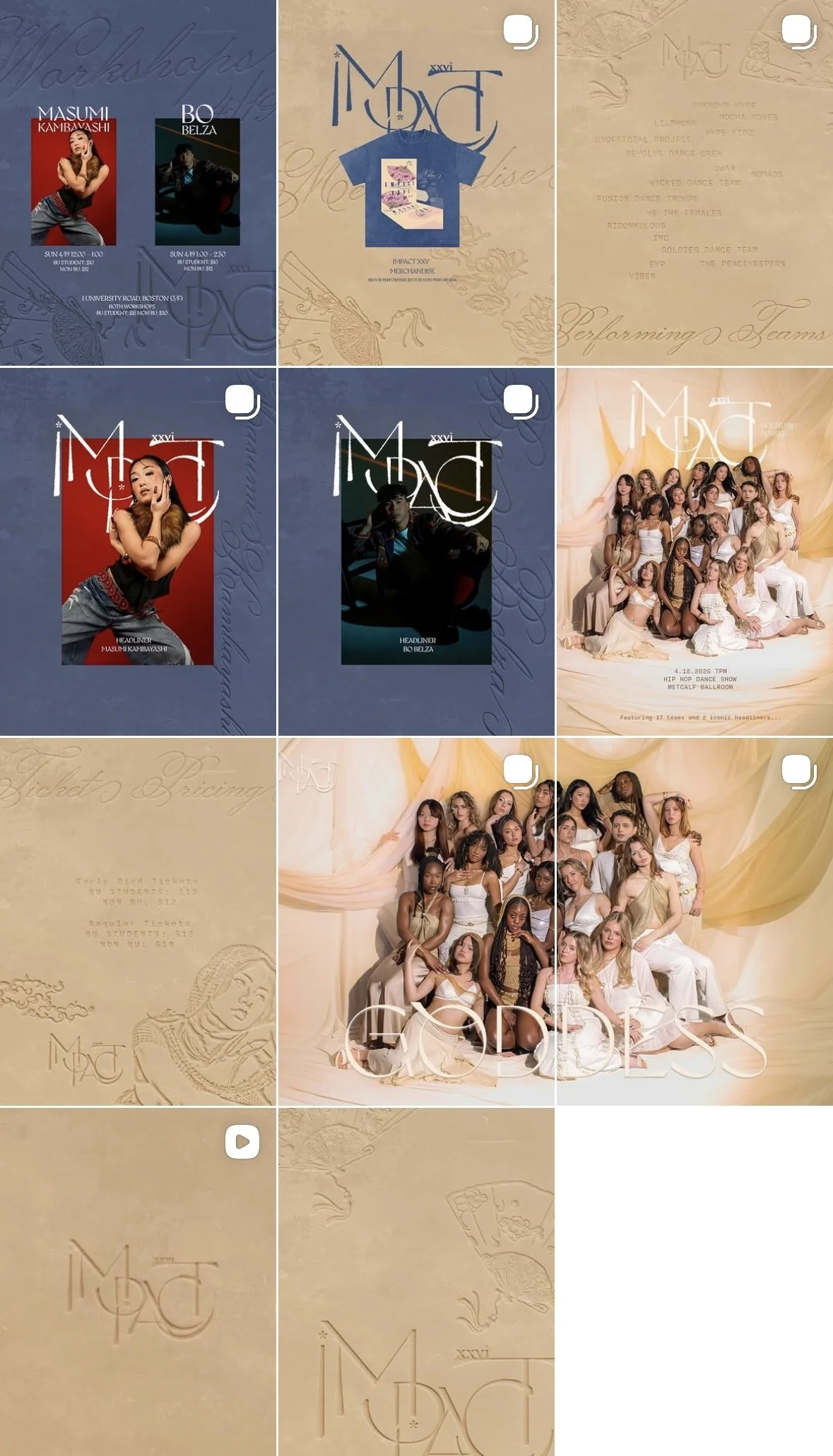
IMPACT XXVI
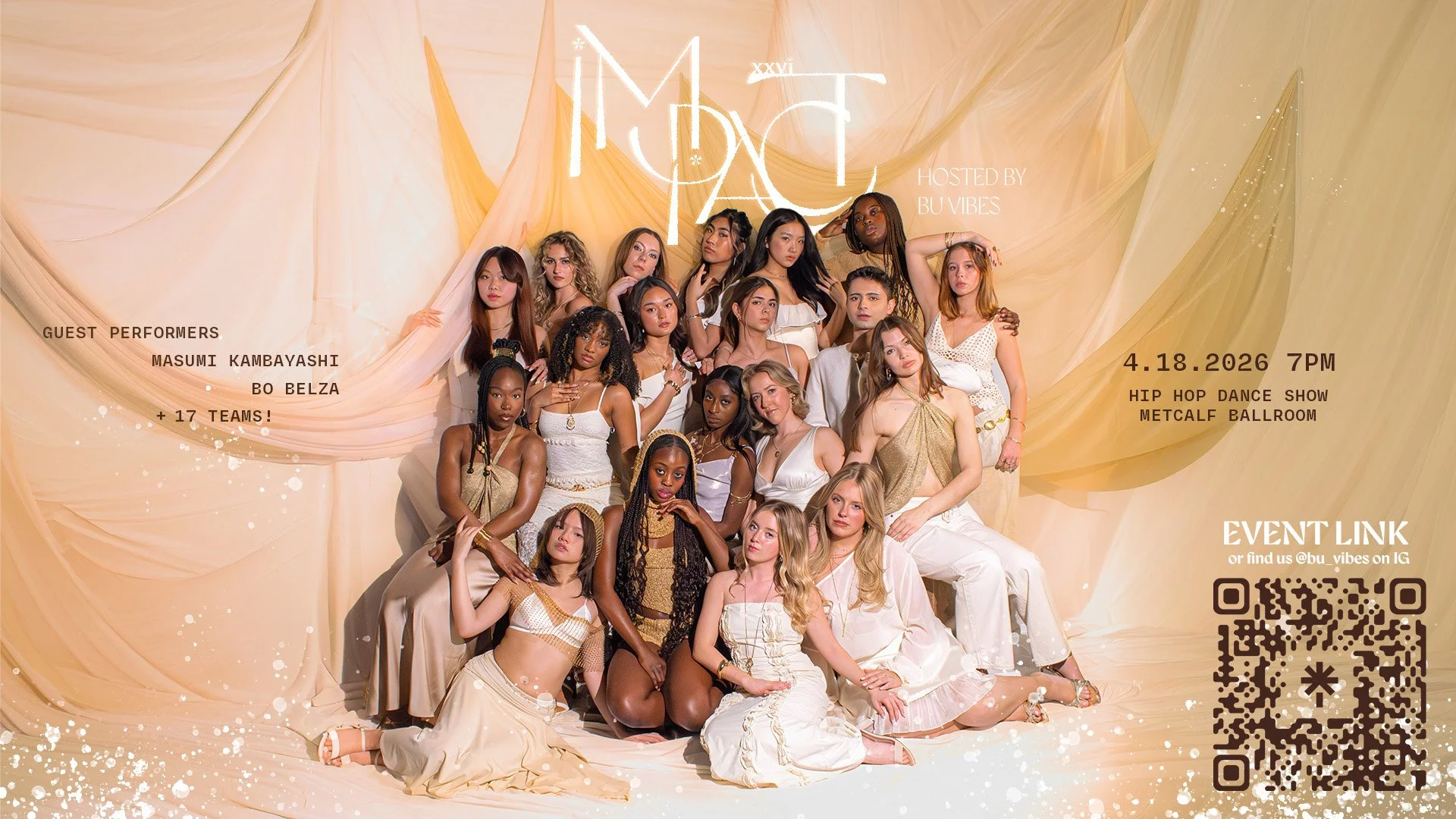
IMPACT is an annual dance showcase hosted by VIBES that invites pre-professional and professional dance teams from the Greater Boston area to showcase their dancing. The art direction for IMPACT XXVI is rooted in the theme of “Goddess” inspired by VIBE’s continuous efforts to spread female empowerment and inclusivity through music and movement.
Deliverables:
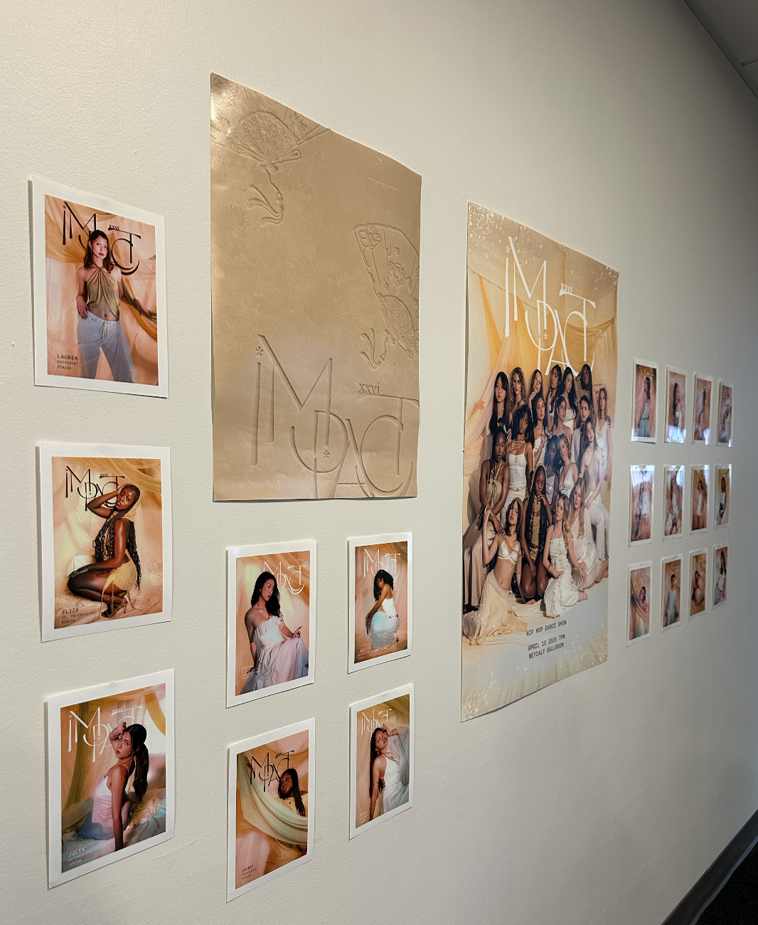
Physical: Posters, Banners, Merchandise, Lanyards, Event Signage
Digital: Instagram Static and Reels, Tik Tok, OOH
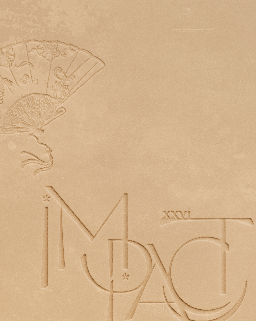
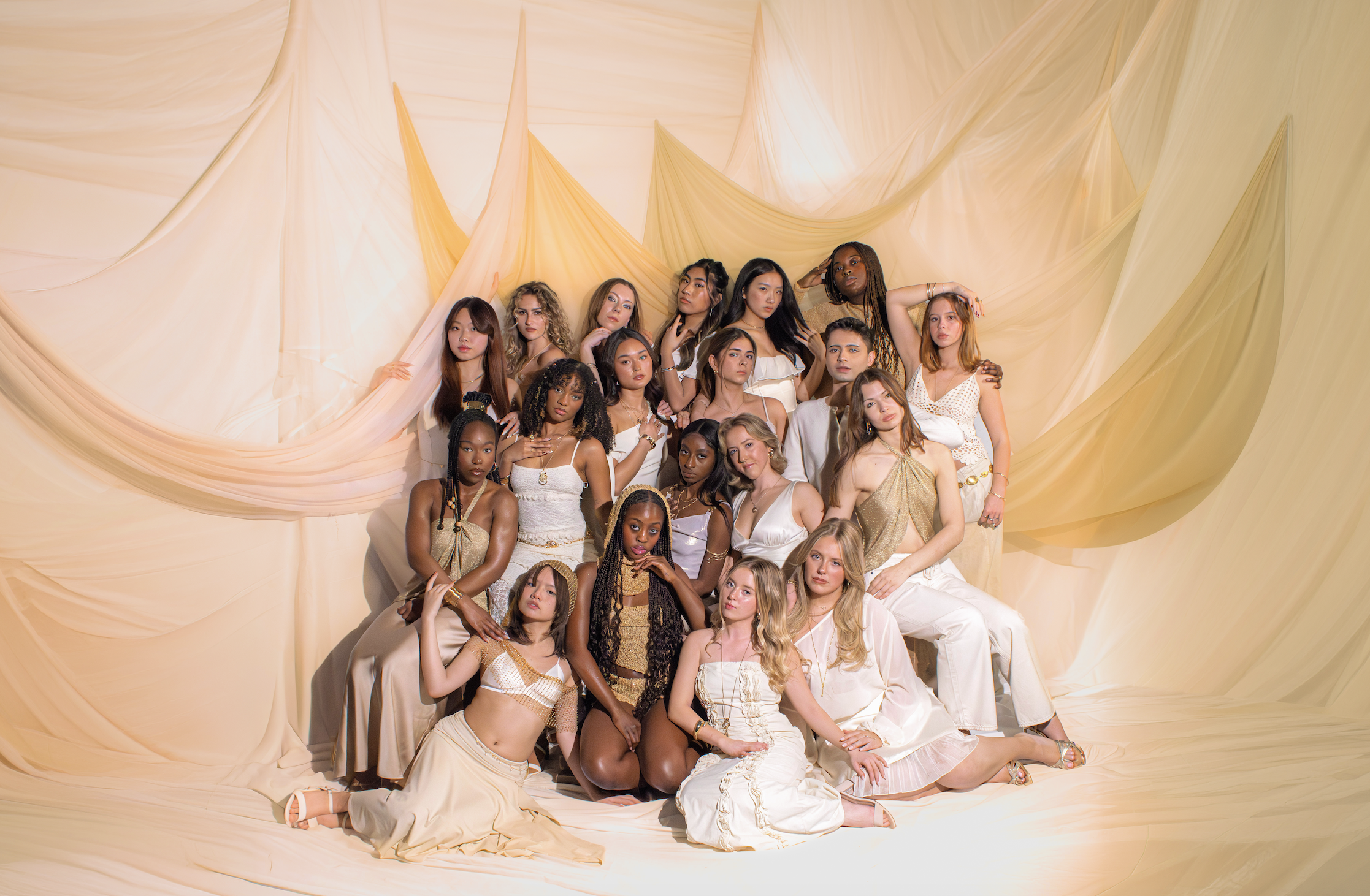
This year’s art direction was rooted in VIBE’s set theme “Goddess.” I drew inspiration from sand art as a central visual language. Each grain placed with intention reflects the care, discipline, and process behind every dancer’s craft. The act of making becomes more meaningful than preserving, reflecting the transient beauty of performance. For the logo design, I maintained subtle, symbolic motifs such as cherry blossoms and crescent shapes to evoke softness, growth, and the quiet strength that goddesses hold.
The visual world was also deeply informed by my Asian heritage. When I think of goddesses, I think of the ones my grandparents spoke about. Figures like Guanyin often linked to lotus flowers and Benzaiten tied to music and artistry. I also wanted to incorporate fans, symbolic of grace and fluidity, qualities often associated with divine feminine power which VIBES embraces. These elements were brought to life through hand illustrations by my co-director of Marketing Design Drea Holder which I then integrated into the graphic designs for the campaign.
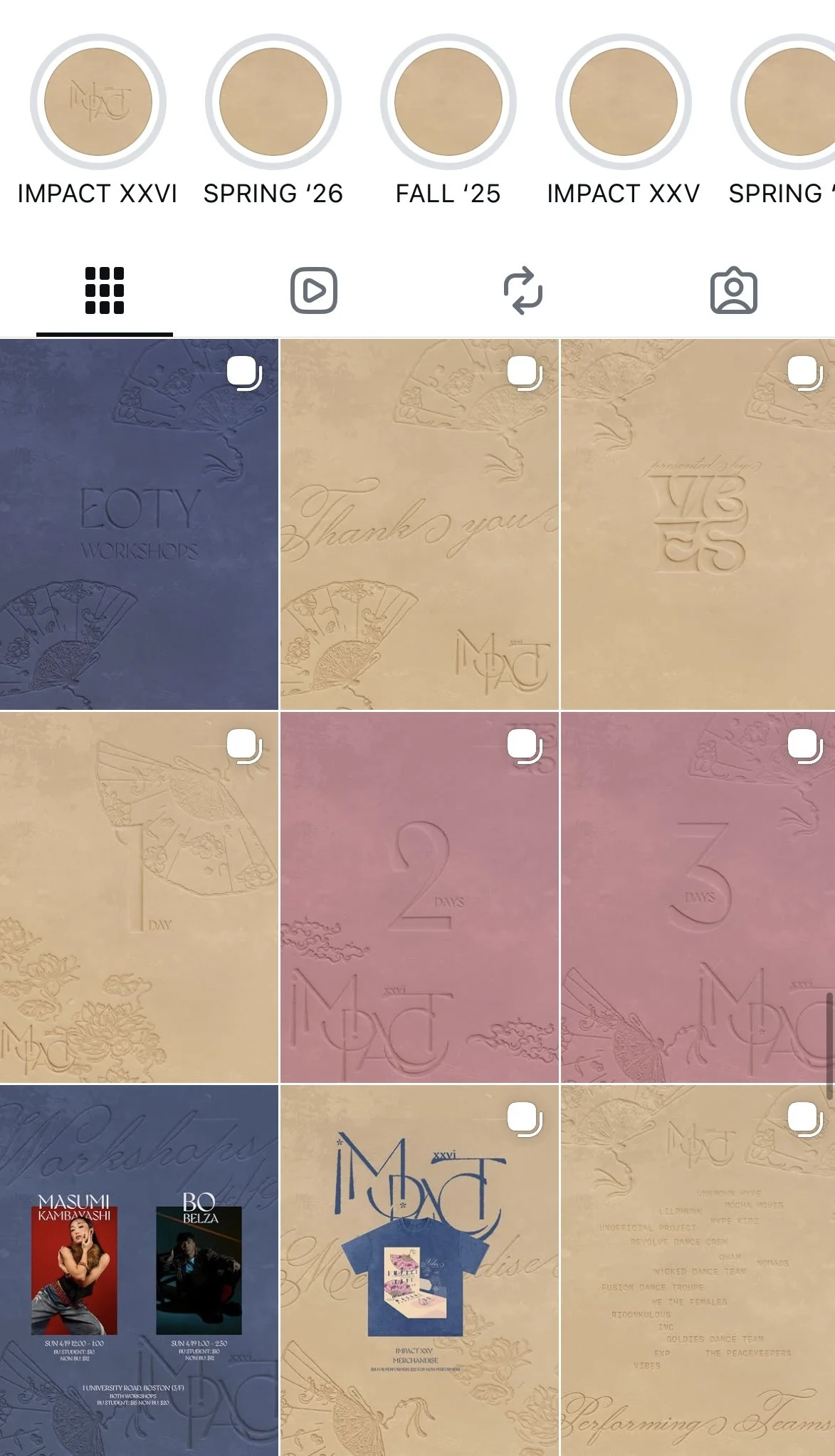
SOCIAL MEDIA
The instagram was carefully curated under this visual universe with the color palette of beige, dusty rose and navy blue. The static posts include announcing the show, headliners, performers, theme, ticket prices and merchandise.
As our target audience is primarily college students, I wanted our reels to feel less curated and more lighthearted by incorporating humour while promoting the show.
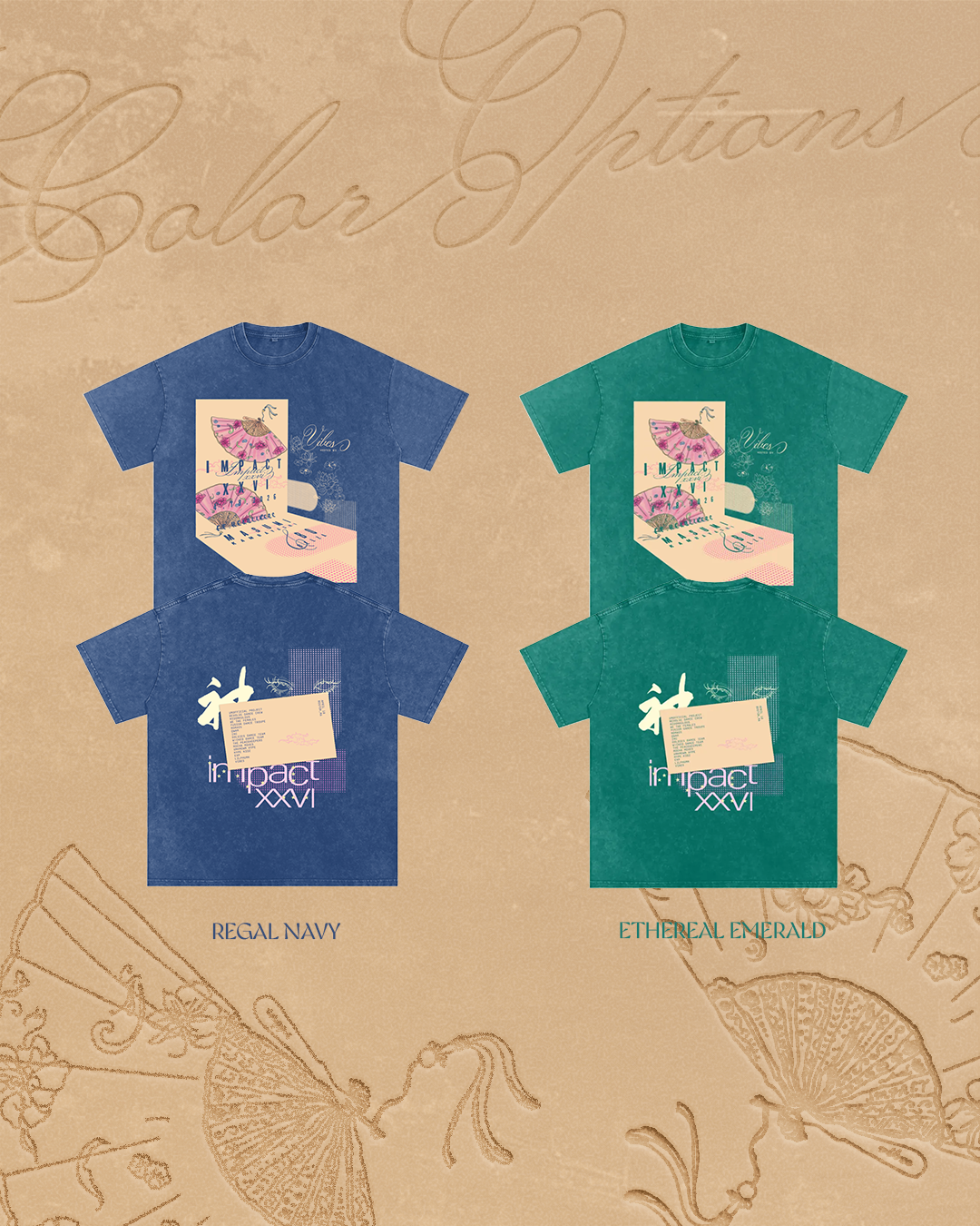
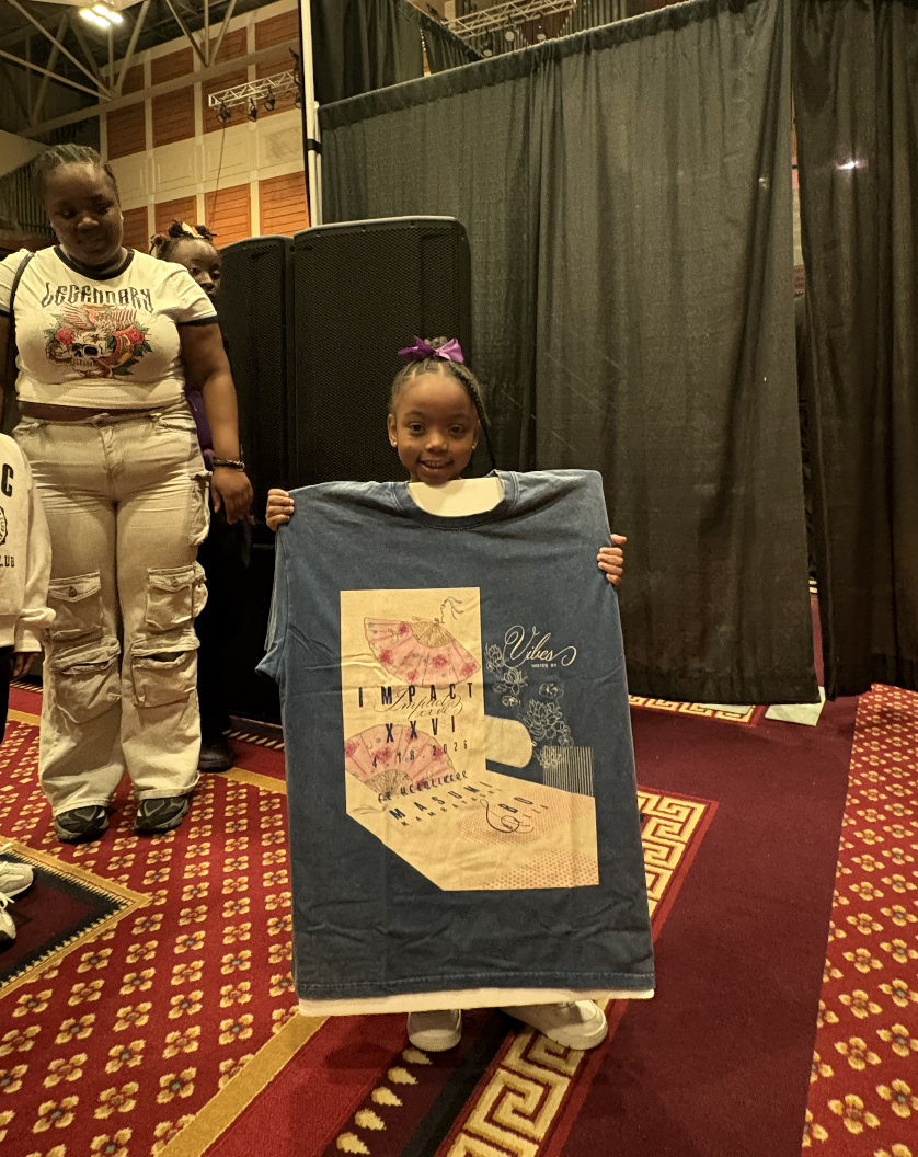
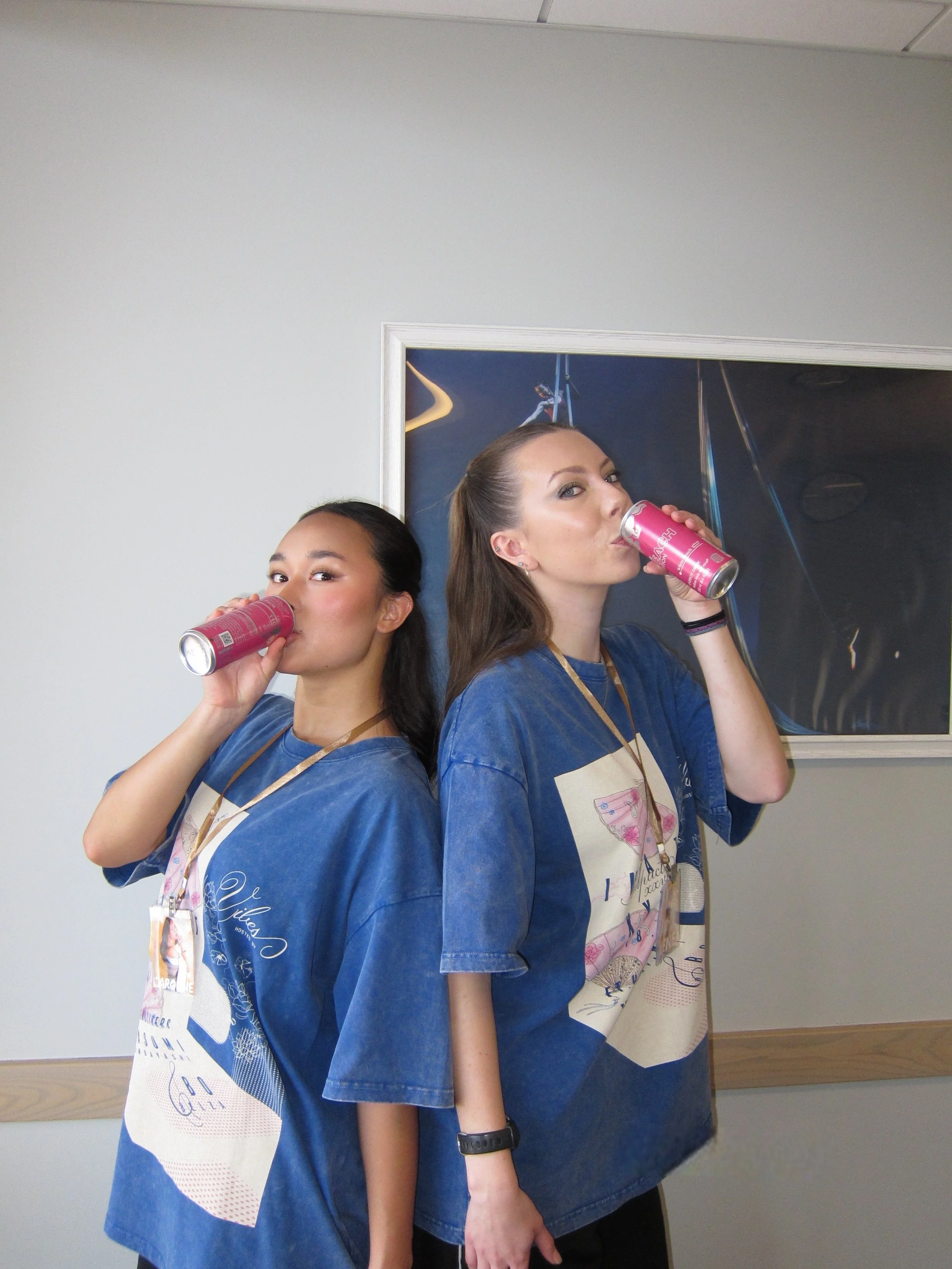
MERCHANDISE
For merchandise, I explored a more contemporary direction, incorporating perspective play, and calligraphic forms. As a small easter egg, the word “goddess” in Chinese calligraphy is subtly embedded on the back of the shirt.
BEHIND THE SCENES
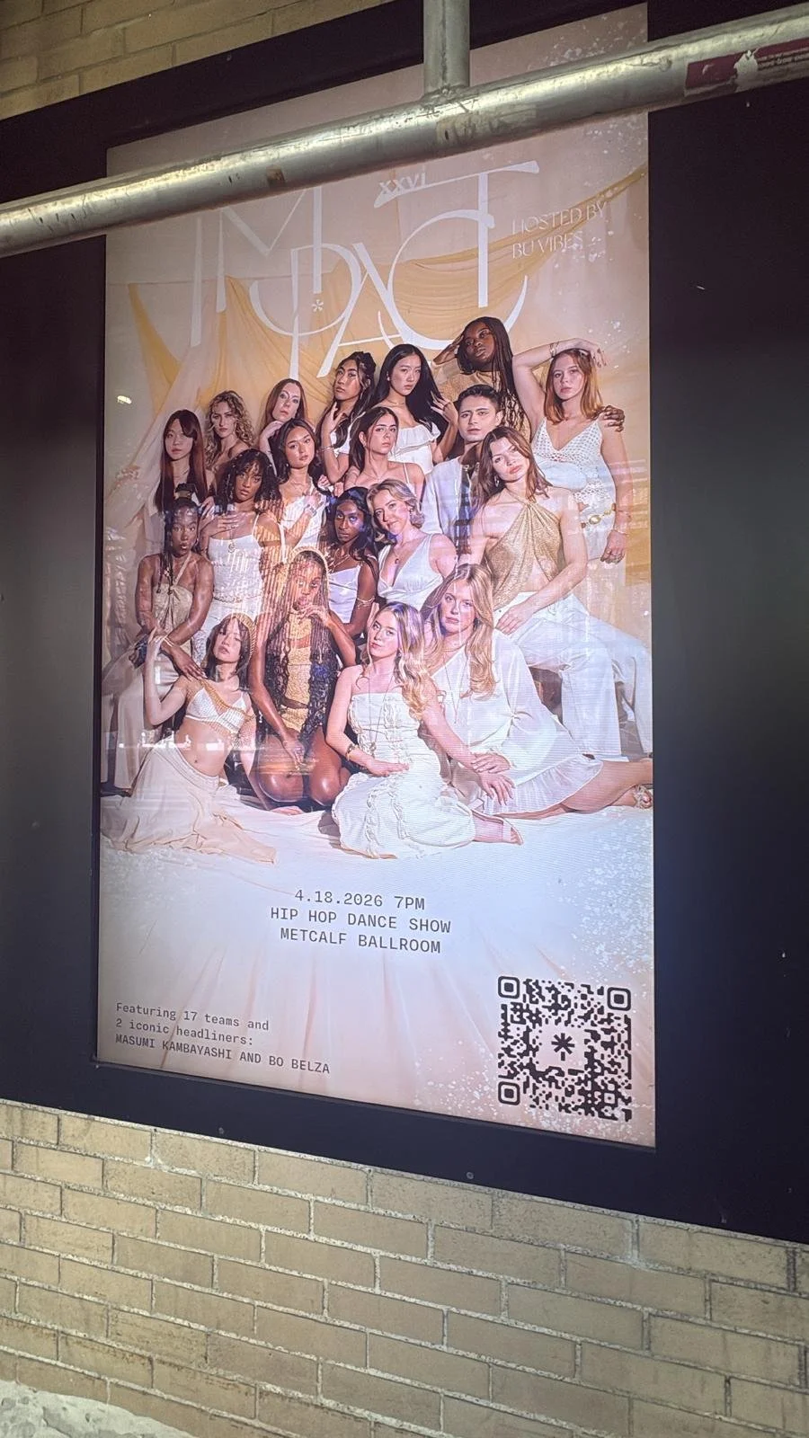
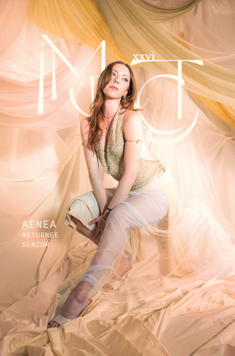
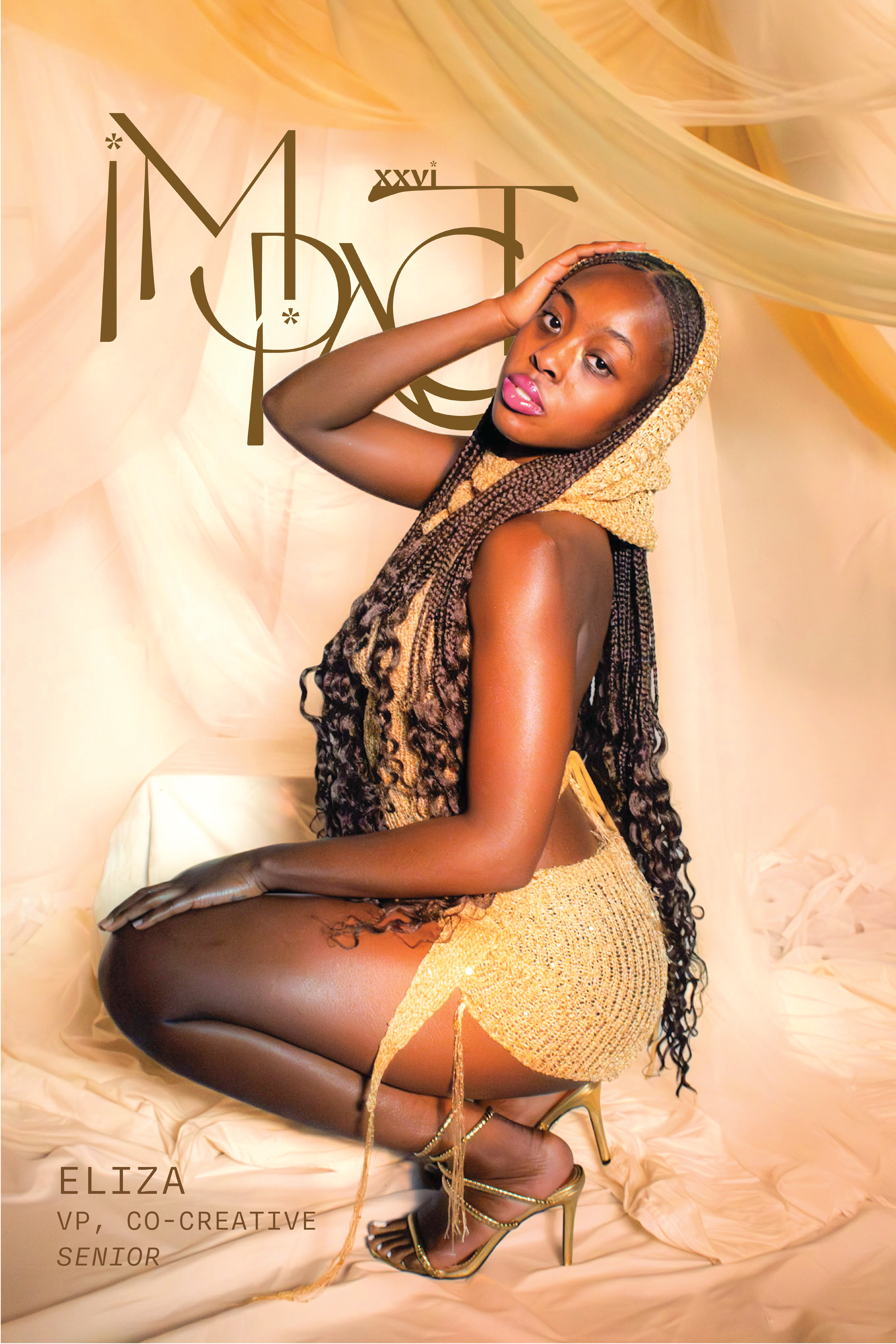
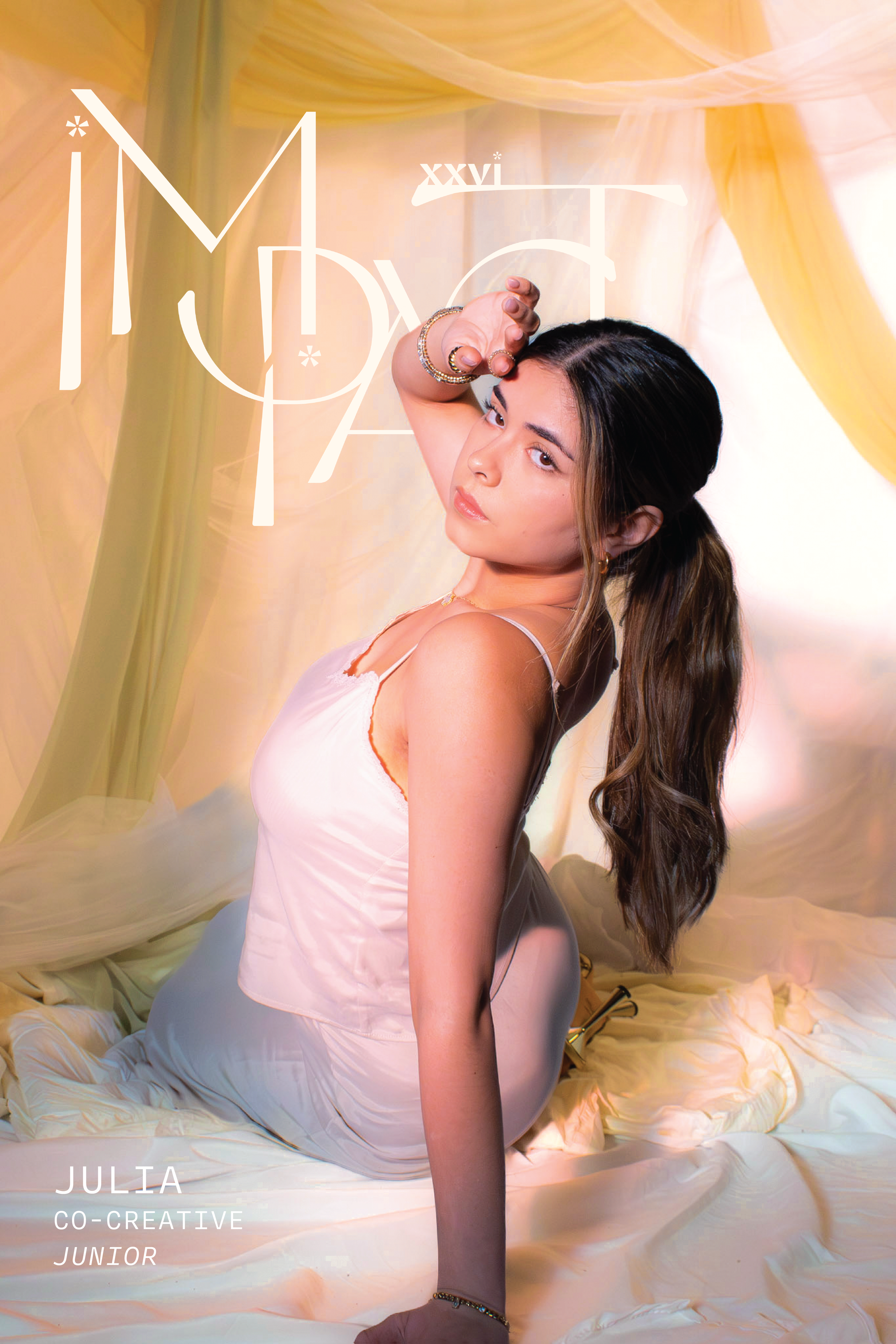
PHOTOSHOOT/POSTERS
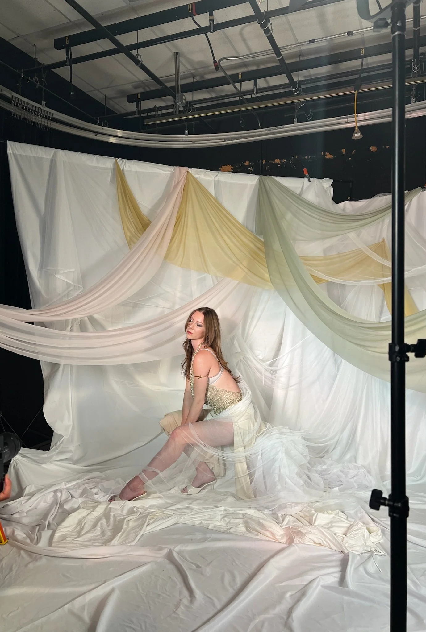
For the photoshoot, I wanted to experiment with texture to illustrate an ethereal atmosphere that resonates with the “Goddess” theme. I draped different mesh fabrics to create that movement and feeling as well as shined light sources through iridescent foil paper to add dimension to the photos. When editing on Lightroom, I also color corrected the backdrop to appear more beige to align with the overall sand art direction as we only had access to a large white backdrop.
POST EDITING
OUT OF HOME
SPECIAL THANKS
Key Illustrator: Andrea Holder
Co Photographer: Sof Martinez Thùy Anh
Special thanks to my marketing team minis Capri Bold, Caroline Kartman, Erica Eastland, our sponsors Red Bull and Doughlicious The London Dough Co. and VIBES E-board for making all of this possible!